
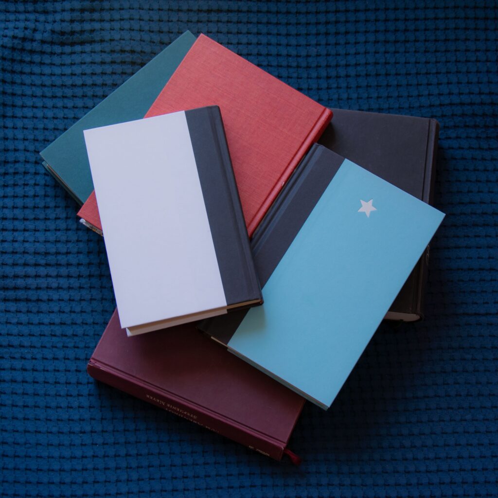
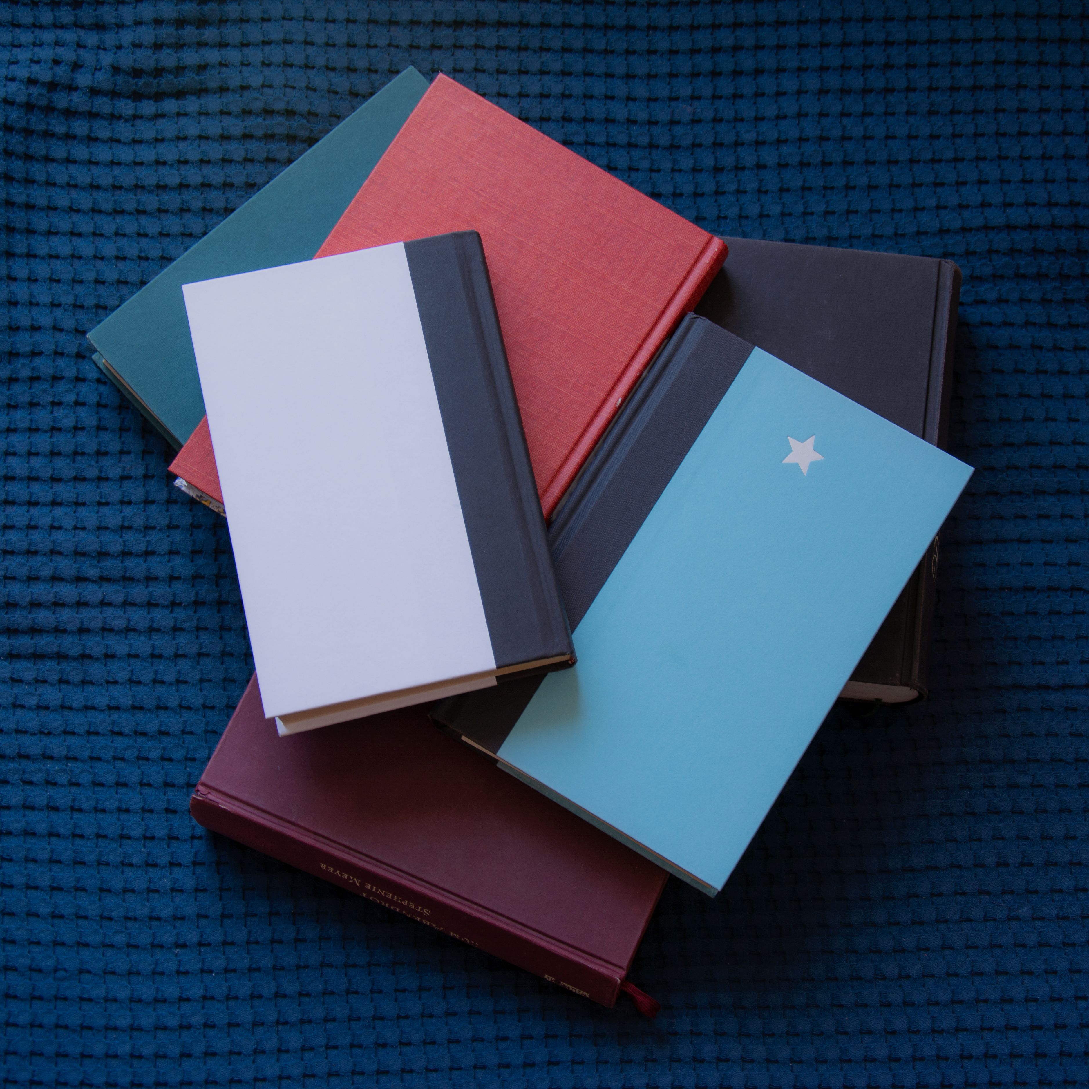
Ever received your printed book with so much excitement? Then slowly the smile fades as you notice a color shift. Maybe, you designed a bright blue cover, and now you are staring at a dark grey color.
This happens all the time due to RGB to CMYK book cover print conversion. This is why some colors on screen look amazing, but becomes different after printing.
So what can you do? Knowing the differences, functions, and principles between these two color models will help you catch this common issue and prevent it before placing an order.
Understanding CMYK vs RGB Printing
RGB and CMYK are like two people who speak different languages. They try to describe a picture using their own different words. Some details will certainly be lost in the translation. They are both doing the same thing but in different ways.
RGB
RGB (Red, Green, Blue) mode uses light to create colors. When designing on your phone or laptop, the RGB chip emits tiny lights to create the colors visible on your screen. It’s just like looking at a bright sunset. You notice the colors seem to glow because they are getting into your eyes directly.
That’s how RGB can create very bright, vibrant colors that make your designs eye-catching on screen.
CMYK
CMYK (Cyan, Magenta, Yellow, and Key (Black) is a subtractive color model the printer uses to create color. Your printer does not produce light. So, it absorbs light from the page and mixes it with tiny dots of ink on paper to create the colors you see.
What makes the difference then is that:
- Ink has limits compared to light.
- It cannot create bright colors the way a glowing screen will.
It’s just like mixing watercolors. The shades you produce will look beautiful. However, you can’t make the paper glow.
This is why the printed cover changes from the colors you had on screen.
Why Does the Conversion Make Colors Look Muddy
Nothing is wrong with your printer if your cover prints look dull. Some RGB colors just don’t exist in CMYK. Ever heard of color gamut? Sounds complicated, right? It is simply the range of colors a system can produce. Between these two color modes, RGB has a larger color range than CMYK. The light it produces creates more intense colors than ink.
So during conversion (which happens when printing), the printer:
- Tries to find the closest possible match to the color on screen or
- Uses a similar color if the CMYK can’t mix the exact color.
This process of trying to completely change two different ways of making colour causes the colours to look flatter. So which colours are more affected?
Colors That Take the Biggest Hit

Source: pexels

Not every color changes by the same amount. You will discover that some colours will remain the same after printing. Unlike most that lose their brightness. Some of these colors include:
- Bright Blues. A bright blue colour will be affected seriously. Printers find it hard to produce this colour. So it often comes out looking darker and less bold.
- Neon Greens. Neon green is also a hard color to print. On paper, the color will look softer and less exciting than the initial design.
- Hot Pinks. Hot pink is a bold, eye-catching color. However, it tends to lose its brightness during conversion. It becomes magenta, rose, or a lighter pink color.
- Deep Purples. Dark or rich purple will also change color during print. The shade will look more blue or gray, and it can change the feel of your cover.
- Electric Teal. Using an electric teal will also change the look of your cover after printing. It loses the bright glow on screen and becomes darker with a greener tone.
Warm colors usually hold up better. On the bright side, there are colors that don’t get affected so much. The hit is minimal and much closer to how it appears on screen. Many warm colours, including reds and oranges, struggle less to retain their tone after print, unlike bright colours.
How to Catch This Before You Print (Not After)
The good news is you don’t always have to make the mistake of printing dull books. You can resolve color problems before ordering print. To do this, you have to print early. One single file takes less time to fix than a hundred printed books. So:
#1. Design in CMYK From the Start
The safest way to avoid this is to create the design in CMYK. The printer shows you colors that can actually be printed on paper. This will reduce your expectation and desire for bright colors.
However, you might choose to design in RGB. To be safe, convert your file to CMYK. Do this at the beginning of the design process, instead of waiting until the end. It gives you time to make color adjustments while also making changes.
#2. Use Your Design Software’s CMYK Preview
CMYK previews are available on most professional design programs. If your software has this feature, use it. With it, you see how your cover will look when printed without having to view it in RGB.
Turn it on before your final export. If colors look muddy, you can make adjustments in time. It’s better to see what could go wrong on your computer than after your printed copy arrives.
#3. Order a Physical Copy (if Possible)
Nothing beats the result. So no matter how perfect the file looks, always order a physical proof copy if possible. This lets you check for more than just color like the paper trim, spine width, image quality, and other important details.
It is far cheaper and saves you more time to replace one proof copy or even 100 copies than say a thousand copies of the book.
Get an experienced team to review your files and check for issues you missed on your own.
Our services page explains how Crows Publishing can help you prepare print-ready book covers and interior files.
What to Do If Your Cover Already Looks Muddy
What if your proof or even the first 100 copies of your books are here and the covers already look darker than expected? Don’t worry. This doesn’t mean you have to start from the beginning.
You can simply improve the result. Edit the CMYK version of your file instead of the original RGB. Small adjustments you make can produce a much better print result.
What this means is, you might:
- Increase the brightness a little.
- Add a little more contrast.
- Boost saturation in the right places.
- Adjust individual colors. Avoid changing the whole image.
A Note on Limitations and Their Solutions
There are limits to the improvements you can make. Edits to a muddy-looking cover depend largely on the colors. There is no amount of editing you can make on designs that use very bright colors the printer can’t produce. It will always appear different from what you had on screen.
The better solution is to redesign the parts of the cover that use those colors. You can use a deeper turquoise background in place of an electric teal. This will produce stronger and more vibrant results because the color is within CMYK’s limits.
You should have an understanding of colors that will likely change, so you can make any needed changes before printing.
Conclusion
Your printer is not faulty because your covers are dull. It is due to the difference between RGB and CMYK. Once you understand that difference, you can make smarter choices and avoid disappointments early.
You can include the help of an expert to simplify the entire process. Our beginners-deal is designed for first-time authors who want professional support without stretching their budget.
We guarantee methods that ensure the print-ready book cover files in your reader’s hands look as good as the one you imagined on your screen.
Frequently Asked Questions
#1. Why does my book cover look different printed than it did on screen?
Your book cover looks different when printed because screens use RGB, and printers use CMYK. RGB creates colors with light. Printers create colors with ink. Printed colors are duller because Ink cannot reproduce every color that light can display.
#2 Can you convert RGB to CMYK without losing color quality?
Yes, you can. However, some colors will almost always change. You should focus more on adjusting the design so the printed version still looks great.
#3 What file format should I use for a print-ready book cover?
You can use a print-ready PDF with the correct CMYK color profile, bleed, trim, and spine measurements. Always check your printer’s file specifications before exporting your cover.
#4 Do I need to design in CMYK from the beginning, or can I convert later?
It is advisable to design in CMYK from the beginning. You get the most accurate preview of the final printed colors. But if you use RGB, convert early to identify areas that need changes before printing.